Gonnie van Dongen – osteopath
Website Design · Website Development · Logo Redesign · Visual Identity

Website Design
Website Development
Logo Redesign
Visual Identity
Project Overview
Gonnie van Dongen is an osteopath based in the Netherlands, specializing in osteopathic treatment for adults and children.
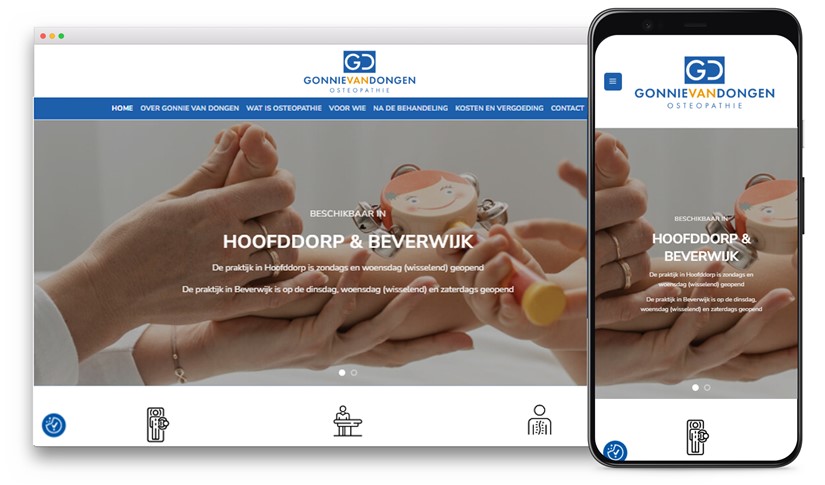
The project involved a complete website redesign and logo rebranding, with the goal of creating a clear, professional digital presence that reflects trust, accessibility, and medical credibility.
Approach
The website was redesigned with a strong focus on simplicity, clarity, and ease of use. A clean layout, balanced use of white space, and a calm color palette were applied to create an approachable and professional visual language.
The content structure was carefully organized to ensure visitors can quickly access information about treatments, expertise, and contact options. The website was developed to be fully responsive and intuitive across all devices.
As part of the rebranding, a new logo was designed based on the initials “GD”, creating a simple and recognizable visual mark. The logo and visual elements were consistently applied across the website and supporting materials to ensure a cohesive brand identity.
Special attention was given to:
- Website structure and content hierarchy
- Responsive design across desktop and mobile
- Logo redesign and visual consistency
- Clear navigation and calls to action
Result
The final result is a modern, accessible website combined with a refreshed visual identity. The platform communicates professionalism and trust while remaining easy to navigate, providing a solid digital foundation for visibility, communication, and ongoing use.


